Finding the best tech websites in 2026 can feel exciting and overwhelming at the same time. When people land on a digital product page, they want quick answers. They want to know what the tool does, who it helps, and how to try it without wasting time. The best tech websites make complex software feel simple in just a few seconds. They swap confusing buzzwords for clear benefits, real screens, and honest proof. Whether you are building a startup page or studying top digital brands, learning from the best tech websites gives you a clear edge. Great design turns curious visitors into happy users fast.
Why Buyer-First Clarity Shapes the Best Tech Websites
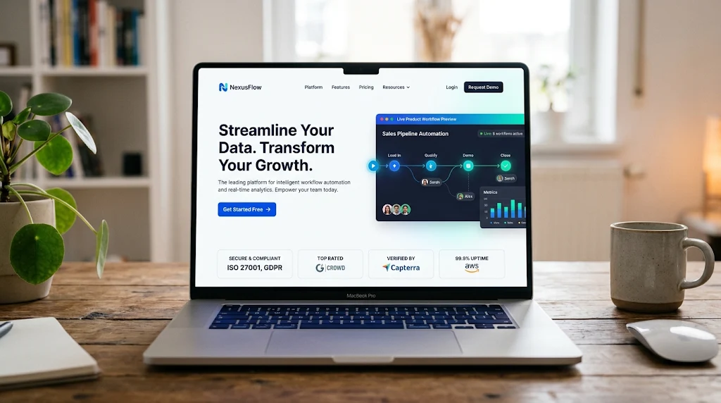
When you study the best tech websites, one big pattern jumps right out. Strong teams start with the buyer, not a long list of technical specs. A clear headline tells visitors what the product solves on the very first screen. Real product views, live prompts, and short workflow demos let people picture using the tool right away. Trust badges, customer logos, and real usage numbers answer safety questions early. When motion guides the eye instead of distracting the reader, the whole page feels calm and smart. Even better, keeping one clear main button makes the next step easy for everyone.
How AI Products and Agents Turn Ideas Into Real Workflows
AI tools can sound abstract, so top creators anchor their pages in real jobs. Look at how SandCastles shows short-form video creation right in its opening view, paired with clear feature blocks and user trust. Atlas AI takes a friendly route for service teams by letting visitors play sample calls and pick how they want to chat. Nolana focuses on messy insurance claims and shows how smart agents connect scattered systems. Lookfor AI highlights everyday support tasks like order edits and shipping updates with a simple switch. Decode by Entropik turns research into an easy prompt box with sample briefs anyone can scan.
What Infrastructure and Data Platforms Teach About Proof and Speed
Infrastructure and data brands speak to builders who love clear proof and sharp speed. KOG sets a bold mood with dark contrast and straight talk about fast token speeds for live agent loops. Primefold shows questions going in and clear answers coming out, complete with a handy pause control on its hero view. Gradient Labs maps out financial workflows like loan checks and evidence gathering in clean visual blocks. When a builder sees real workflows instead of vague hype, trust grows right away. These examples prove that smart structure beats loud claims every single time.
How Growing SaaS Tools Make Setup Feel Simple and Safe
Growing businesses need software that feels helpful from day one. UGC Hourly makes creator hiring feel safe by showing flexible pay models and large creator reach. Billow keeps freelance and studio work calm with a full lead-to-paid view and an interactive cockpit anyone can click. Lorikeet speaks directly to fintech, health, and insurance teams with warm type, clear accuracy wins, and easy trial choices. Each of these sites respects the buyer’s time. They show how the product fits daily work before asking for a big commitment.
Why Security and IT Brands Win With Compatibility and Low Risk
Security and IT buyers care deeply about safe fits and zero headaches. KLYRO Security shines by explaining how teams can connect new apps into existing identity tools without ripping anything out. Showing familiar platform logos right away answers big worries in seconds. Adding a simple savings calculator invites teams to test value before booking a call. When security teams see clear compatibility and real numbers, doubts fade fast. Good tech product pages remove fear so buyers can focus on results.
What Classic Product Leaders Prove About Interface and Speed
Classic software leaders still set high bars for clarity and polish. Linear proves that fast interface motion can show speed better than any paragraph ever could. Vercel turns a live build log into a hero story that speaks to both coders and executives. Stripe treats code samples and docs like front-door tools so builders can test ideas right away. Notion uses clean page structure to mirror the calm order its app creates. Figma matches its design-focused crowd with crisp interactive views and sharp visual craft.
How Research and Creative AI Brands Match Tone to Craft
Research and creative AI brands win by matching their mood to their craft. Anthropic chooses quiet clarity and careful words over loud hype, which builds deep trust. Perplexity puts a working search box front and center so visitors feel the tool on arrival. Runway lets rich video outputs speak louder than long feature lists. Supabase stands out with fresh green energy and real database code right up front. Cursor keeps friction tiny with a one-line promise and a direct download path for busy coders.
What Tech News and Review Hubs Teach About Easy Browsing
Tech news and review hubs teach another vital lesson about easy reading. Sites like The Verge, Wired, TechCrunch, and Engadget use clean grids, strong photos, and clear menus so readers find stories fast. Mashable, Gizmodo, Digital Trends, and CNET balance open space with lively visuals that stay easy on the eyes. The Next Web, MakeUseOf, PCMag, and Tom’s Hardware organize deep guides so curious minds never feel lost. SlashGear, Android Central, TechRadar, and TechSpot turn busy topic hubs into friendly digital libraries.
Why Human Voice and Clean Layout Beat Loud Marketing Hype
From my own years watching digital products launch, the biggest mistake teams make is hiding behind fancy words. Visitors do not wake up hoping to read a dictionary of tech jargon. They want a friendly guide who understands their daily headache and shows a working fix fast. When you compare the best tech websites side by side, the winners always feel human. They load quickly on phones, keep text crisp, and give visitors room to breathe. A welcoming page invites people to stay, explore, and share what they find.
Complete Breakdown of Top Tech Website Patterns
| Website / Group | Primary Category | Standout Visual & UX Strength | Key Takeaway to Apply |
| SandCastles | AI Video & Creator Tools | Dark high-contrast hero paired with live workflow blocks and user count badge | Pair the finished outcome with the actual tool view on screen one |
| Atlas AI | AI Voice & Chat Agents | Bold gradient hero with playable call samples and dual action choices | Let non-technical buyers hear or test real examples right away |
| Nolana | Vertical AI (Insurance) | Short two-line problem hook, partner logos, and clear platform paths | Name the exact operational mess before introducing the tool |
| Lookfor AI | AI Customer Support | Inbound/outbound workflow switch, star rating, and monthly volume proof | Group features around everyday jobs buyers already handle |
| Entropik AI (Decode) | AI Research & Insights | Interactive prompt box with ready-to-scan sample research briefs | Replace dense feature grids with real prompts visitors can try |
| KOG | LLM & AI Infrastructure | Restrained dark canvas with concrete speed benchmarks and clean nav | Back bold speed claims with clear numbers and quick links |
| Primefold | Decision Intelligence | Input-to-output visual flow plus an accessible pause button on motion | Show data moving from question to answer, and respect motion controls |
| Gradient Labs | Financial AI Operations | Isometric workflow map labeling compliance and loan steps clearly | Turn broad platforms into visual maps buyers can read in seconds |
| UGC Hourly | Creator Marketplace SaaS | Transparent pricing models, brand quotes, and 100k+ creator scale | List flexible ways to work together so buyers see an easy fit |
| Billow | Freelance & Studio SaaS | Soft calm palette, lead-to-paid summary, and clickable demo cockpit | Let visitors click around a live-style dashboard before signup |
| Lorikeet | AI Customer Concierge | Warm serif headline, accuracy metrics, and trial plus demo options | Pair human warmth with hard numbers for regulated industries |
| KLYRO Security | Identity & IT Security | No-replacement promise, partner logos, and built-in ROI calculator | Answer compatibility fears early and offer a quick value check |
| Linear & Vercel | Workflow & Dev Infra | Speed-focused motion and live build logs in the opening view | Let product speed show through interface rhythm and load times |
| Stripe, Notion & Figma | Core SaaS & Design Tools | Docs-as-demo, structured page flow, and rich interactive previews | Make the website itself feel like a working sample of the product |
| Tech Media Hubs (16 Sites) | News, Reviews & Guides | Scannable grids, strong photography, clear menus, and open whitespace | Keep heavy topic libraries easy to browse on both desktop and phone |
Frequently Asked Questions
What makes the best tech websites stand out right away?
The best tech websites explain what the product does and who it helps within the first few seconds. They use plain words, show real screens or workflows, and place proof like customer logos near the top. Instead of overwhelming visitors with every button in the app, they highlight the main benefit and keep one clear next step easy to spot.
How should a tech website show a complex product?
A smart way to show a complex product is through context rather than a long feature dump. Short demos, interactive prompt boxes, sample calls, or step-by-step workflow maps help visitors picture daily use. When people see inputs going in and helpful results coming out, the product feels practical and approachable.
Why do trust signals matter so much on software pages?
Software buyers take real risks when they adopt a new tool or share company data. Clear trust signals like recognizable customer logos, named quotes, usage milestones, and compliance badges lower worry fast. Honest numbers and clear privacy notes show that the team cares about reliability as much as clever features.
Should tech websites offer more than one way to get started?
Yes, giving visitors a clear primary button alongside a secondary option works well for different comfort levels. Some people want to jump straight into a free trial or interactive demo, while others prefer a guided walkthrough or sales chat. Keeping labels simple and consistent prevents confusion across the page.
How do top tech media sites keep large libraries easy to read?
Leading tech publications rely on clean grids, generous whitespace, and clear navigation menus. Strong photos and scannable headings help readers jump straight to topics they care about. Even when a site holds thousands of guides and reviews, good layout choices keep browsing relaxed and fast.
What role does page speed and mobile design play in tech sites?
Speed and mobile polish act like quiet proof that the team builds quality work. Many buyers check pages on their phones between meetings, so slow loads or cramped text hurt trust immediately. Fast images, readable contrast, and smooth layouts make the whole brand feel modern and dependable.
Conclusion
Now it is your turn to put these lessons into action! Pick one page on your site today and make its opening message clearer, sharper, and friendlier. Show a real workflow instead of a dry feature list, and check how it feels on your phone. If you want help shaping your homepage headline, section flow, or product table next, share your product details and let’s build something great together!